Generating Perfect Color Palettes for UI/UX Design
Creating color palettes that resonate well within UI/UX design requires a deep understanding of color theory, perceptual differences, and user experience implications. This article dives into the advanced methodologies and tools necessary to generate color palettes that not only look great but also function effectively.
Understanding Color Relationships
At the core of generating a perfect color palette is understanding color relationships in the color wheel. The common relationships include:
- Analogous Colors: These are colors positioned next to each other on the color wheel, such as yellow, yellow-orange, and orange. They work well together and create serene designs.
- Complementary Colors: Colors that are opposite each other on the color wheel (like blue and orange). They create high contrast and can grab attention effectively.
- Triadic Colors: Three colors that are equidistant from each other on the wheel. For instance, red, blue, and yellow create a vibrant palette that's balanced yet dynamic.
In a professional design context, the choice of color relationships often hinges on the desired emotional response from users and the overall brand identity.
Color Theory Fundamentals
To delve deeper, color theory must be referenced for better decision-making:
- Hue: Refers to the actual color (red, blue, yellow, etc.).
- Saturation: Indicates the intensity of the color; a highly saturated color appears more vivid.
- Brightness: Adjusts how light or dark a color appears.
Understanding these components helps in manipulating colors to achieve either vibrancy or subtlety based on user needs and interface requirements.
Tools for Color Palette Generation
Given the importance of color palettes in UX, employing the right tools is critical. Here are some advanced tools that can enhance the process:
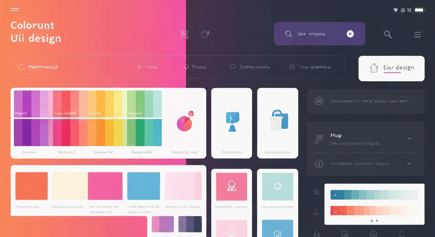
1. Palette Generator
This tool allows designers to create cohesive color schemes based on specific hues and tones, automatically generating various shades that maintain harmony and contrast.
2. Color Theory Calculators
Implement tools like Adobe's Color CC for complex calculations of color harmony, where you can visualize different schemes based on chosen colors. Understanding the mathematical relationships behind colors often leads to better UI decisions.
3. Image Extraction Tools
Using tools like the Image Color Extractor can generate palettes directly from images. This is particularly useful for brand integration and ensuring visual consistency with existing materials.
Incorporating Accessibility Standards
With the increasing emphasis on inclusive design, knowing the Web Content Accessibility Guidelines (WCAG) is paramount. Developers must ensure sufficient contrast between text and background colors. Here are some important guidelines:
- The minimum contrast ratio for text or images of text against their background is 4.5:1.
- For large text (≥ 18pt), the minimum contrast ratio is 3:1.
Tools for Contrast Checking
Using a contrast checker tool allows professionals to validate their color choices against WCAG standards effectively. Tools like the Contrast Checker provide instant feedback on color combinations, illustrating numerical contrast ratios and compliance levels.
Psychological Effects of Colors
Colors evoke feelings, and their comprehension can vastly influence user behavior on digital platforms. Some key psychological effects include:
- Red: Conveys urgency (commonly used in action buttons).
- Blue: Instills trust and calmness (widely found in financial apps).
- Green: Associated with growth and serenity.
Designers must leverage these associations mindfully while creating palettes that align with agency goals.
Nuanced Trade-offs in Color Choice
Choosing a color for a UI element involves nuanced decision-making, understanding not only aesthetics but also functionality and accessibility trade-offs:
- Color blindness should be a consideration; about 8% of men and 0.5% of women are affected. Choosing colors that are distinguishable for color-blind individuals is necessary. Using tools like the Color Blindness Simulator can help visualize how your palette appears to these users.
- Test your palette under various lighting conditions. Monitors often render colors differently in terms of brightness and saturation.
Advanced Gradient Use
The application of gradients in UI is more than just aesthetics. Designers utilize gradients to enhance depth and guide user focus. Calculating bezier curves for smooth transitions helps achieve a natural flow of colors that feels organic and professional. Utilize CSS gradient syntax effectively, with complete control over color stops and transitions:
background: linear-gradient(to right, #ff7e5f, #feb47b);The above CSS snippet illustrates a basic rightward gradient transitioning from one color to another.
Color Palettes for Specific User Scenarios
Color selection should also account for the specific context in which the UI exists:
- E-commerce Platforms: Use warm colors for sale banners to create urgency, while cooler tones can be employed for regular content.
- Healthcare Apps: Lean towards soothing greens and blues to promote trust and calmness.
- Educational Tools: Bright, motivating colors can create an engaging environment for students.
Creating a contextually relevant color palette requires not only creative sensibility but also knowledge of user expectations and emotional responses.
The Role of Feedback Loops
With every design iteration, collect feedback on your color choices. Optimize for usability based on cognitive load and perception of color congruence within the interface. Use A/B testing to gather data on how users react to different palettes, enabling a data-driven approach to color optimization.
In advanced UI/UX design, leaning on these methodologies and tools equips professionals with the capacity to create distinctive, effective, and appealing color palettes. As the discipline continues to evolve, the intersection between color science and user experience becomes more intricate, necessitating ongoing learning and adaptation. Harnessing color in service of both aesthetics and usability remains a pivotal challenge in design.